Color
Definition
Color is the element of art that is produced when light, striking an object, is reflected back to the eye.
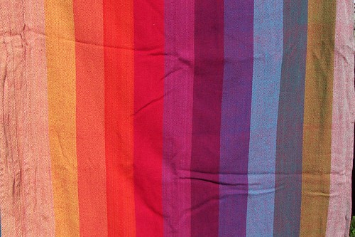
There are three properties of color. First is hue, which means the name we give to a color (i.e. red, yellow, blue, etc...).
The second property is intensity, which refers to the strength and vividness of the color. For example, we may describe the color blue as 'royal' (bright, rich, vibrant) or 'baby' (light, pale, soft).
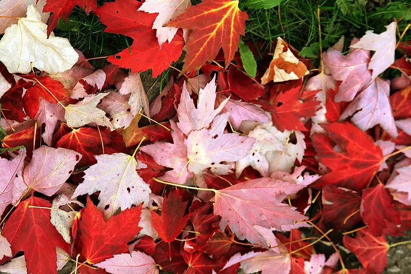
The third and final property of color is its value, meaning its lightness or darkness. The terms shade and tint are in reference to value changes in colors. Tints are created by adding white to a hue. Red mixed with white creates the tint, pink. Shades are created by adding black to a hue. Red mixed with black creates the shade, maroon.
Color schemes are usually the first thing I choose when creating a new painting. Do I want the painting to convey a particular mood? If so, I had best choose my colors carefully.
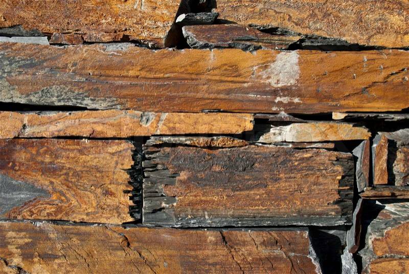
I find myself drawn to earth tones - yellow ochre, burnt sienna and umber, red oxide, ultramarine blue, turquoise, etc...


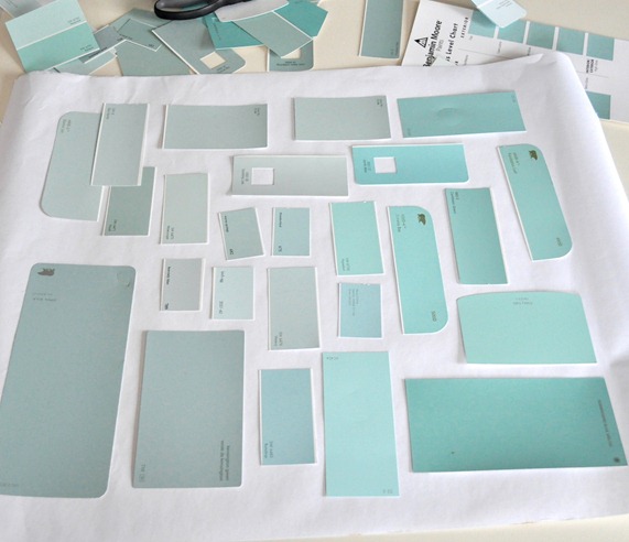
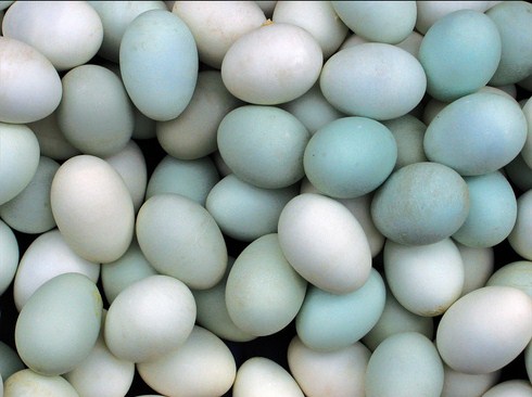
It seems that I also utilize a robin's egg blue, beige, and reddish color scheme in many paintings. It is definitely a variant on the primary color triadic color scheme of blue, yellow and red. Color choices are sometimes as conscious as they are subconscious - they can happen magically.

Gem tones are another scheme that I am strangely attracted to. Reminiscent of autumn, pretty jewels and shiny things.


Sometimes I think that I might have a slight case of synesthesia - I can hear music in color. Odd, I know. This song, for example, is most definitely yellow.
No comments:
Post a Comment