Design has always been a huge source of inspiration. Before I ultimately received a BFA in studio art, I was studying graphic design and received a certificate. I couldn't deal with the impersonal nature of creating work on a computer versus actually creating something on tangible canvas, so I switched majors - but I did learn a lot and still enjoy good design practice. I will even work on commissioned design pieces as a contract designer if I absolutely have to (even though I don't really enjoy the work). I have always been drawn to design from the 1920s (i.e. Bauhaus) and its simple austerity and clean lines. I am not a fan of fancy frill and flourishes, although it has its place in the Victorian era. I really like what a lot of contemporary designers are doing nowadays, especially with gig posters - the art form of screen printing limited edition concert posters for more independent musicians. With this contemporary style, colors and shapes are once again simple, with a retro feel but distinctly new, and profoundly effective and inventive. Borrowing from these styles is how other designers can become parts of a certain movement or gain inspiration to create new movements.
Design:
Design reveals. Design reveals meaning, design reveals a
message, design reveals function. Bad design does the opposite: It
obscures, it hides. The reason why that almost never makes bad design
art is that the subject is supposed to be revealed
Just as other things influence me, I am also influenced by the work of other artists. My favorite time period being the 1950s and forward. Abstract Expressionism is probably the genre of modern art that is most influential to me. I tend to go back to my monographs on Abstract Expressionist artists over and over to look for color choices, techniques, composition, etc... There is an energy to this genre that was unseen at the time - as"painterly" paintings were en vogue, these animalistic paintings represented a paradigm shift in the art world. Color field paintings, while categorized as Abstract Expressionist, are much different from the more gestural types of paintings that have come to represent the genre.
Abstract Expressionism:
A development of abstract art that originated in New York in the 1940s and 1950s and aimed at subjective emotional expression with particular emphasis on the creative spontaneous act (e.g., action painting). Leading figures were Jackson Pollock and Willem de Kooning
Some key artists of the genre:
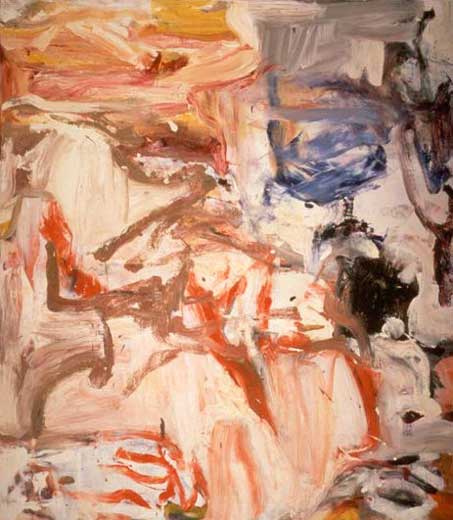
Willem de Kooning By about 1945, Willem de Kooning’s two main tendencies, painting figures and abstractions, seemed to fuse perfectly, notably in Pink Angels. By 1955, de Kooning turned to a symbolic aspect of woman, as suggested by the title of his Woman as Landscape, in which the vertical figure seems almost absorbed into the abstract background. His later work showed an increasing preoccupation with landscape.
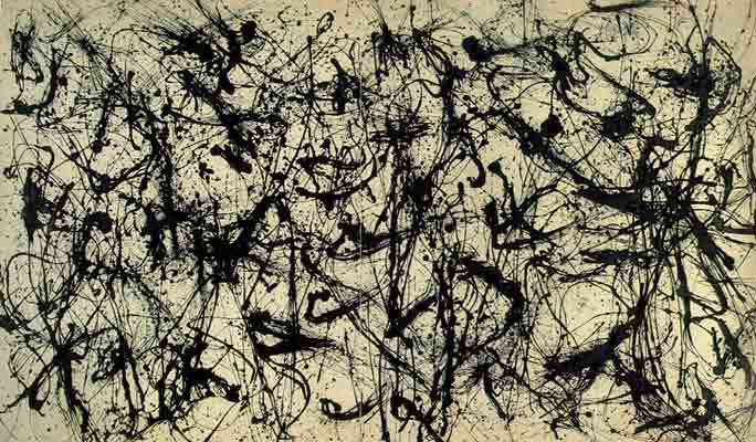
Jackson Pollock An icon of Abstract Expressionism, Jackson Pollock had his first solo show in 1943 at Peggy Guggenheim's gallery in New York. With his wife and fellow artist Lee Krasner, Pollock moved from New York City to East Hampton, and converted a barn into an art studio where he created his drip paintings.
Franz Kline
Franz Kline's story reads like a movie plot: Young artist
starts out with high hopes, spends years struggling without success, eventually
finds a style, becomes an "overnight sensation" and dies too soon. He
left us with the understanding that one of the ways to approach Abstract
Expressionism was through psychic vision. He couldn't explain what his
paintings meant, because that wasn't their purpose. Kline's paintings were
supposed to make one feel, not comprehend.
Helen Frankenthaler
(born Dec. 12, 1928, New York, N.Y., U.S.died Dec. 27, 2011,
Darien, Conn.) U.S. painter. She studied with Rufino Tamayo in high
school and at Bennington College, then returned to her native New York City and
joined the second generation of Abstract
Expressionists. Influenced by Jackson Pollock and Arshile Gorky, she
developed a style featuring abstract colour combinations within large expanses
of bare canvas. She perfected the technique of colour staining, producing
diaphanous colour by thinning the oils and letting them soak into the unprimed
canvas. In the 1960s she began to use acrylic paints. Though abstract, many of
her paintings (e.g., Ocean Desert, 1975) evoke landscapes and are noted for
their lyricism. Her work influenced the colour-field painters Morris Louis
and Kenneth
Noland. She was married to Robert Motherwell from
1958 to 1971.
Joan Mitchell Joan Mitchell is known for the compositional rhythms, bold coloration and sweeping gestural brushstrokes of her large and often multi-paneled paintings. Inspired by landscape, nature and poetry, her intent was not to create a recognizable image but to convey emotions. Mitchell's early success in the 1950s was striking at a time when few women artists were recognized. She referred to herself as the "last Abstract Expressionist," and she continued to create abstract paintings until her death in 1992.
Cy Twombly Cy Twombly (1928–2011) was born in 1928 in Lexington, Virginia. He studied at the School of the Museum of Fine Arts, Boston (1947–49); the Art Students League, New York (1950–51); and Black Mountain College, North Carolina (1951–52). In the mid-1950s, following travels in Europe and Africa, he emerged as a prominent figure among a group of artists working in New York that included Robert Rauschenberg and Jasper Johns. In 1968, the Milwaukee Art Center mounted his first retrospective. This was followed by major retrospectives at the Kunsthaus Zürich (1987) travelling to Madrid, London and Paris; the Museum of Modern Art, New York (1994) (travelling to Houston, Los Angeles, and Berlin) and the Pinakothek der Moderne in Munich (2006). In 1995, the Cy Twombly Gallery opened at The Menil Collection, Houston, exhibiting works made by the artist since 1954. The European retrospective "Cy Twombly: Cycles and Seasons" opened at the Tate Modern, London in June 2008, with subsequent versions at the Guggenheim Bilbao and the Museum of Modern Art in Rome in 2009. Recent exhibitions include "Cy Twombly: The Natural World, Selected Works 2000-2007," The Art Institute of Chicago (2009) and "Sensations of the Moment," the Museum Moderner Kunst Stiftung Ludwig, Vienna, (2009). In 2010, Twombly’s permanent site-specific painting, Ceiling was unveiled in the Salle des Bronzes at the Musée du Louvre. At the same time he was made Chevalier of the Légion d’Honneur by the French government.
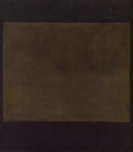
Mark Rothko Born in Russia, painter Mark Rothko emigrated to the United States in the early 20th century and became a pioneer of Abstract Expressionism. His best-known works, a number of which are on very large canvases, involve the juxtaposition of large areas of melting colors.
This At the Drive-In song, written almost 50 years after the birth of the genre, best exemplifies the mood felt when looking at these works of art, as well as the mood and frame of mind necessary to create this type of art
Color is the element of art that is produced when light, striking an object, is reflected back to the eye.
There are three properties of color. First is hue, which means the name we give to a color (i.e. red, yellow, blue, etc...).
The second property is intensity, which refers to the strength and vividness of the color. For example, we may describe the color blue as 'royal' (bright, rich, vibrant) or 'baby' (light, pale, soft).
The third and final property of color is its value, meaning its lightness or darkness. The terms shade and tint are in reference to value changes in colors. Tints are created by adding white to a hue. Red mixed with white creates the tint, pink. Shades are created by adding black to a hue. Red mixed with black creates the shade, maroon.
Color schemes are usually the first thing I choose when creating a new painting. Do I want the painting to convey a particular mood? If so, I had best choose my colors carefully.
I find myself drawn to earth tones - yellow ochre, burnt sienna and umber, red oxide, ultramarine blue, turquoise, etc...
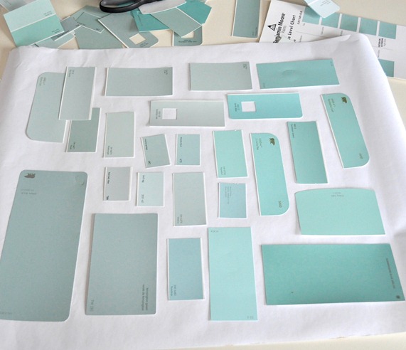
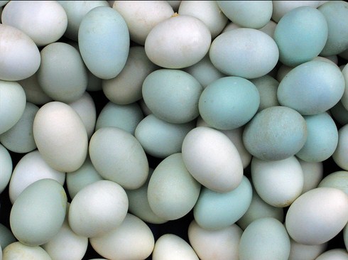
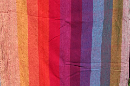
It seems that I also utilize a robin's egg blue, beige, and reddish color scheme in many paintings. It is definitely a variant on the primary color triadic color scheme of blue, yellow and red. Color choices are sometimes as conscious as they are subconscious - they can happen magically.
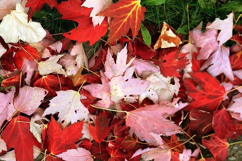
Gem tones are another scheme that I am strangely attracted to. Reminiscent of autumn, pretty jewels and shiny things.
Sometimes I think that I might have a slight case of synesthesia - I can hear music in color. Odd, I know. This song, for example, is most definitely yellow.
A composition is the arrangement of visual elements in a picture. It can be things like the angle of the point of view in a figurative picture or it can be more abstract elements like the placement of light and dark areas or the placement and angle of lines which can keep your attention focused on the page (or canvas) or lead your eye straight off in some direction if badly done.
Composition is the hardest part of creating a painting. A boring composition can break an exciting piece of art while an exciting composition can carry even the most boring works of art. When I work abstractly, I struggle with coming up with creative compositions every time I put my brush to the canvas. What I do instead of creating brand new compositions is that I look for compositions in existing imagery or pictures I have taken myself and deconstruct it to achieve the composition I want. I do this usually by squinting at the image and looking for just the light and dark values. Separating the positive and negative space from an image is also key. Design rules apply, of course, and I must be conscious of not placing things smack dab in the center of the canvas. It's also important to create depth and space in my abstract pieces.
Sometimes, the music I listen to when I paint can determine the outcome of the composition, as well as the brush strokes, color choices, speed at which I paint, etc... I will often paint to the beat and syncopation.
Here is an example of a song that could affect the composition of my work:
Here are some of the types of images I look for when deconstructing compositions:
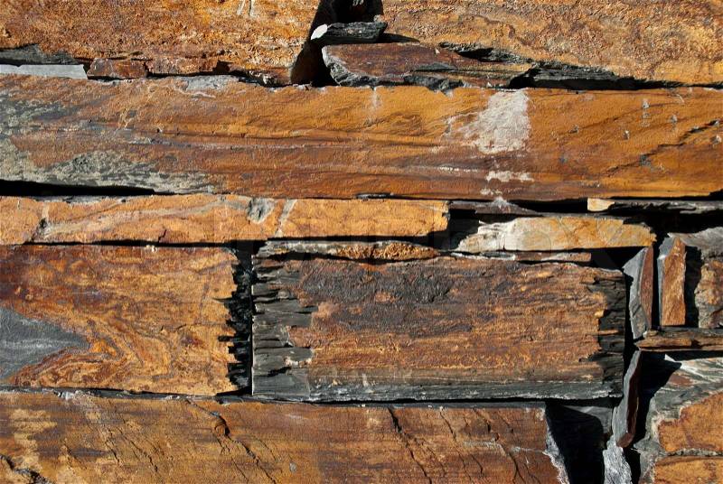
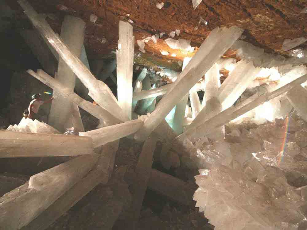
Cave Landscapes (Rock, Crystal & Ice)
I find caves to be dynamic and full of great lines. The jagged stalactites and stalagmites create anxiety and uneasy feelings. This is a major component in a lot of my abstract paintings.
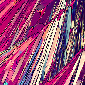
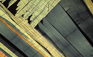
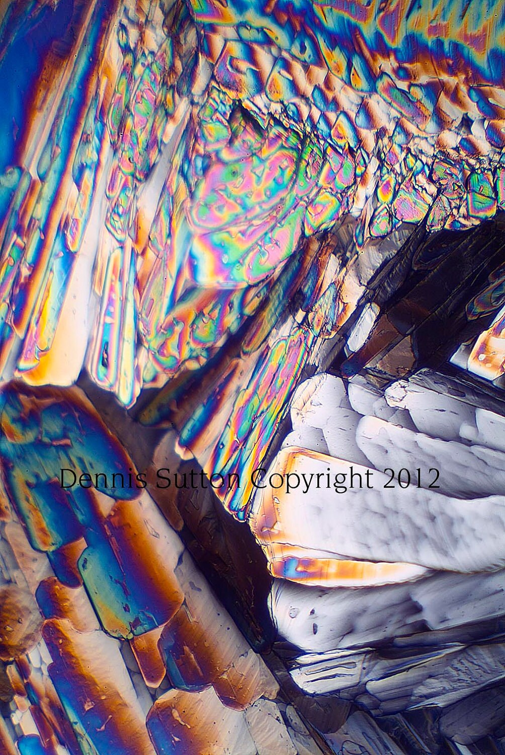
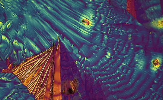
Micro Photography
I draw from the compositions in these photographs regularly. http://micro.magnet.fsu.edu/micro/gallery.html Zoomed-in photography of items like sugars, minerals, proteins, etc.. as seen under a microscope have truly amazing compositions (and colors). Here are a few found around the web...
Pattern is the repetition of an element (or elements) in a work.
An artist achieves pattern through the use of color, lines or shapes.
I love it when I create accidental patterns in my work. It's not conscious but it's a happy, serendipitous occurrence that I will run with once it happens.
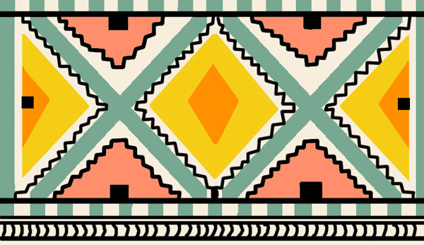
Here are some patterns that I could use in my work somehow - or maybe steal borrow its color schemes at the very least:
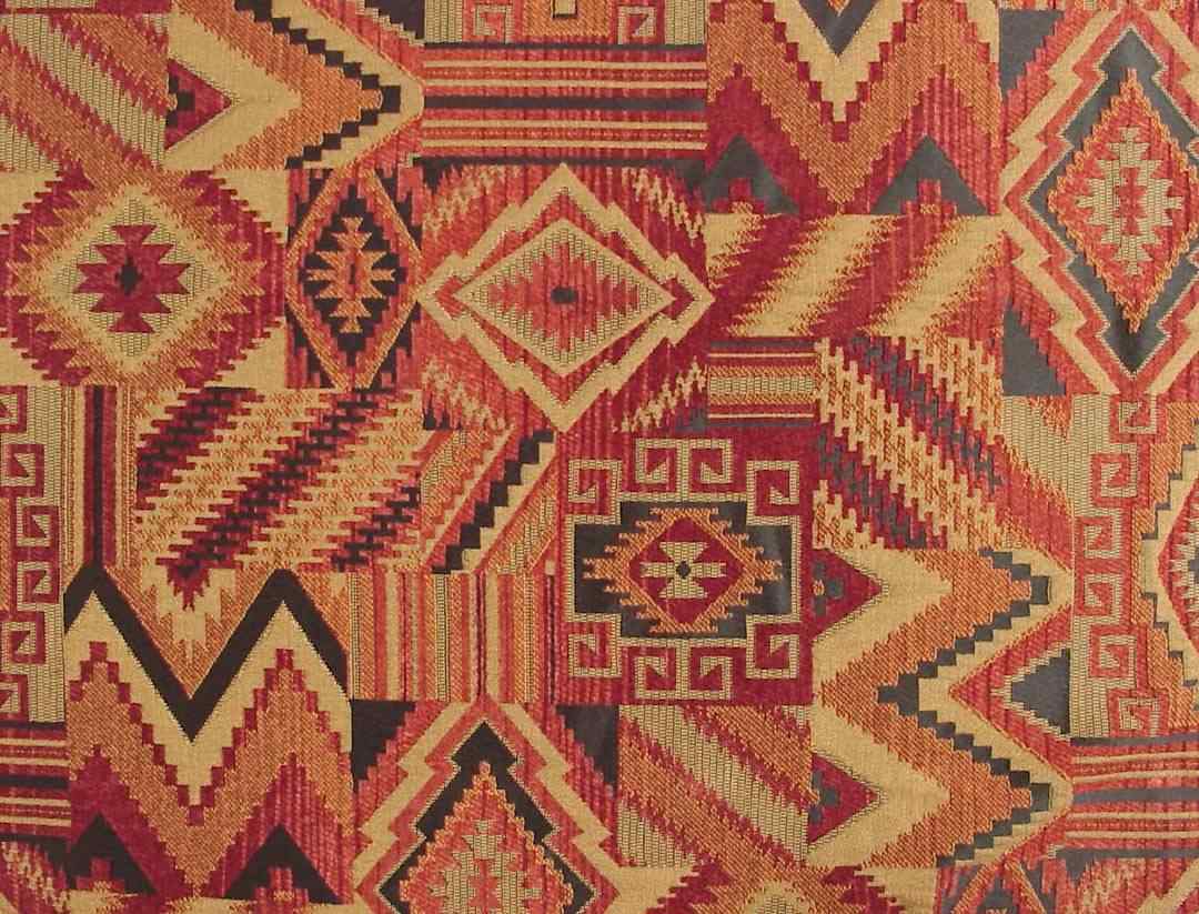
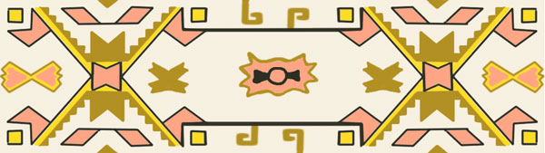
Southwest
Native patterns are really popular right now - which makes me almost not want to like this because I see it everywhere. Nothing can kill a good thing like ubiquity. However, I have always had a strong affinity toward the Southwest region of the US and love the geometry in Native American patterns. It brings back fond memories of an extended road trip when I was 9 years old through the California desert, Nevada, Arizona, New Mexico, Texas, and Oklahoma – roaming the gift shops looking for all things turquoise and silver. My abstract work can be semi-autobiographical, so it's important to me put down things that I like or that is of significance to me. I can be transported there again any time I put on a Gram Parsons record or anything 'hair country', have tequila with lime in the summer sun, or look at these types of patterns.
Quilts
There are a lot of really neat patterns and colors in quilting that I could appropriate into my work. It's amazing to me how people are able to create such intricate designs through needle and thread.


